
How Much Solar Power Will I Generate in NZ? (By Region)

"How much power will my panels actually produce?" It is the first question every homeowner asks, and the answer depends heavily on where in New Zealand you live.
We pulled satellite irradiance data from PVGIS (ERA5 dataset, 2005-2023 averages) for 15 NZ cities and calculated the specific yield for each. No marketing estimates, no best-case scenarios. Just the numbers.
The short version: the difference between the best and worst city is only about 20%. Every major NZ city outperforms London, and the UK already has over a million solar installations.
Solar Output: Every NZ City Ranked
This table shows specific yield: the number of kilowatt-hours produced per kilowatt of installed capacity per year. It is the standard way to compare solar performance across locations, because it removes system size from the equation.
All figures assume crystalline silicon panels at optimal tilt with 3% system losses. Real-world output may vary by 5-10% depending on your roof angle, shading, and equipment.
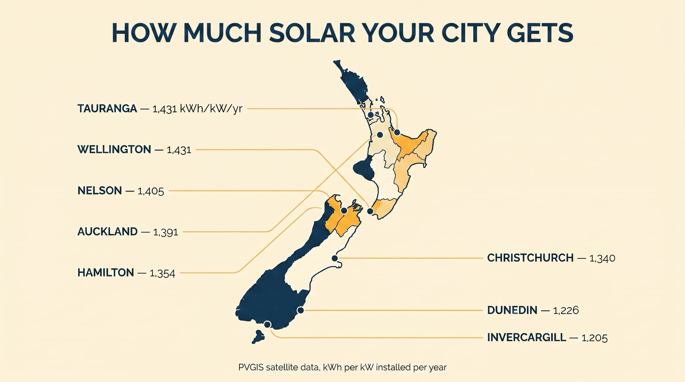
Source: PVGIS-ERA5 satellite data (2005-2023 averages). GHI = Global Horizontal Irradiance.
The top-to-bottom range is 1,431 (Wellington) to 1,137 (Invercargill). That is a 20% gap. For context, the gap between Sydney and Melbourne is only 6%.
What a 6.6kW System Produces by City
A 6.6kW system is the most popular residential size in New Zealand (typically 15-16 panels). Here is what you can expect it to generate in each city over a full year.
A 6.6kW system in Wellington produces 9,444 kWh per year. That is enough to cover 100-120% of an average three-person household's annual consumption (7,500-8,500 kWh). Even in Invercargill, the same system covers around 85-95%. For what a 6.6kW install actually costs in 2026, our NZ pricing breakdown by system size walks through fully installed prices and what should be on every quote.
A standard 6.6kW system generates 7,500-9,400 kWh per year, depending on your city. That covers most of your power bill.
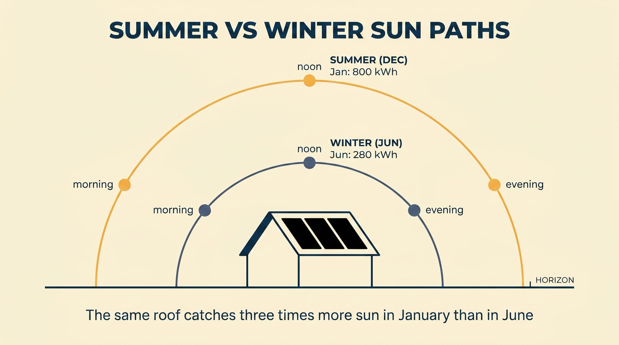
Seasonal Breakdown: Summer vs Winter
Annual averages hide a big seasonal swing. In summer, your panels produce 3-4 times more than in winter. The further south you go, the more extreme this swing becomes.
These are monthly figures for a 6.6kW system. June is the worst month everywhere in NZ.
Auckland (6.6kW)
Auckland's winter minimum (June) is 28% of the summer peak. That is 333 kWh, or about 11 kWh per day. Still enough to run your fridge, hot water heat pump, and a few lights.
Christchurch (6.6kW)
Christchurch drops harder in winter: June is just 18% of peak. But notice December output (1,242 kWh) actually edges out January (1,235 kWh). Canterbury gets its best solar days in late November through early January.
Dunedin (6.6kW)
Dunedin has the most extreme seasonal swing of any major NZ city. June output (188 kWh) is just 16% of the December peak (1,176 kWh). If you are in Dunedin and thinking about a battery, this is worth considering: winter generation will be minimal.
The further south, the bigger the seasonal swing. Auckland: 28% winter-to-summer ratio. Christchurch: 18%. Dunedin: 16%.
Three Surprises in the Data
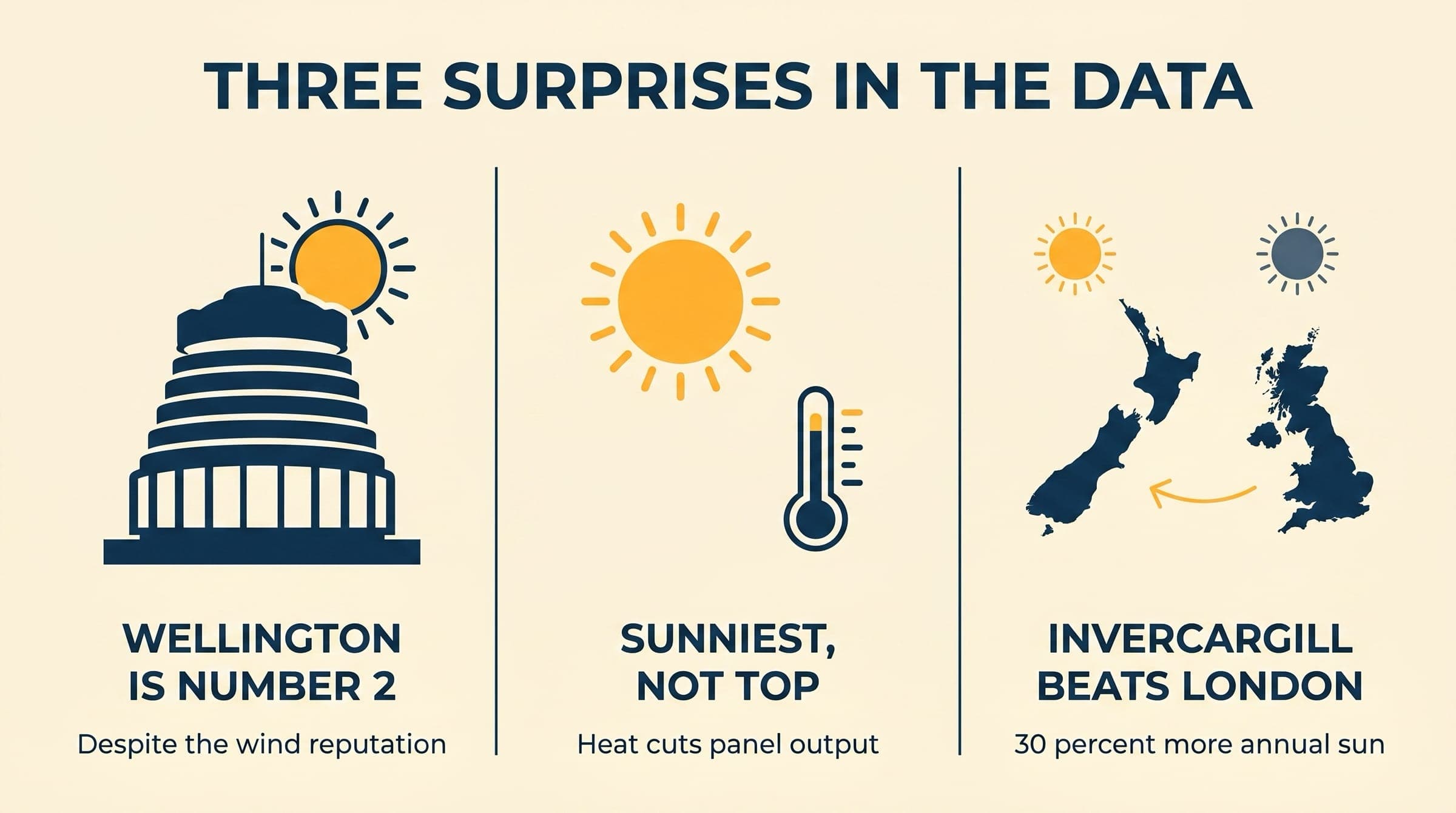
1. 1. Wellington ranks #2 in the country
Wellington has a reputation for wind and rain. So how does it produce 1,431 kWh/kWp, second only to New Plymouth?
Two reasons. First, wind cools the panels. Solar panels lose 0.3-0.5% efficiency for every degree above 25°C. On a still summer day in Hawke's Bay, panels can hit 65°C and lose 12-20% of their rated output. Wellington's constant breeze keeps panels at 40-50°C, reducing losses to 5-13%.
Second, Wellington benefits from clear east-coast weather patterns. Despite fewer sunshine hours than Blenheim or Nelson, when the sun is out in Wellington, the air is clean and the irradiance is strong.
2. 2. Blenheim has the most sun but not the most output
Blenheim logs 2,521 sunshine hours per year, more than any other NZ city. Nelson follows with 2,497. Yet Blenheim ranks third for specific yield (1,407 kWh/kWp) and Nelson ranks eighth (1,361).
The explanation is latitude. At -41.5°, the sun sits lower in the sky than in Auckland (-36.8°). Each sunshine hour in Blenheim delivers less irradiance than one in Auckland, because the light passes through more atmosphere at a lower angle. Sunshine hours alone do not tell the full story.
3. 3. Even Invercargill beats London
Invercargill is NZ's lowest-ranked city at 1,137 kWh/kWp. London produces 1,154 kWh/kWp. That is close, but the point stands: every NZ city from Whangarei to Queenstown comfortably outperforms the UK, which has over a million solar installations.
If solar works in London, it works in every NZ city. Full stop.
Estimated Savings by City
Solar output alone does not determine your savings. Electricity prices vary significantly by region. Here is the energy component (usage cost, excluding lines charges) by city, as of February 2026.
Source: Canstar / MBIE QSDEP, February 2026. Energy component only (excludes lines charges and GST).
The national average is 25.41c/kWh. Tauranga pays the most (29.81c), making solar there roughly 28% more valuable per kWh than in Palmerston North (23.03c). Your retailer choice matters too: see how NZ retailer buy-back rates compare for the kWh you export rather than self-consume.
Including lines charges and GST, total residential costs range from about 34.61c/kWh in Wellington to 48.93c/kWh in Balclutha. The most expensive regions benefit disproportionately from going solar. Our full payback breakdown for NZ households walks through how those rate differences feed into a 6 to 10 year payback window.
Get a free solar estimate for your address and see how much you could save based on your city, roof, and power bill.
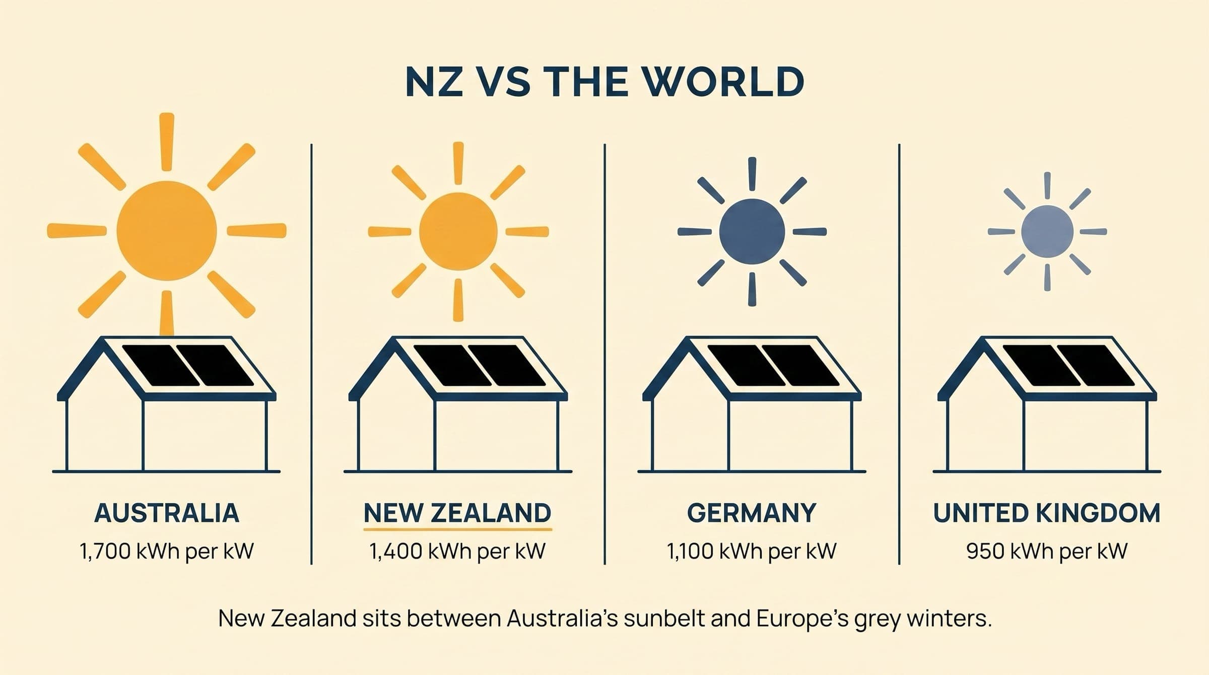
How NZ Compares Globally
New Zealand is not Australia. But it is far better for solar than most of Europe, and comparable to southern France and northern Spain.
Source: PVGIS satellite data.
- Auckland and Wellington produce 95-98% of Melbourne's output
- NZ is only 8% behind Sydney, which is one of the world's strongest solar markets
- Even Invercargill produces 98% of what London gets
- NZ receives about 4 kWh/m² per day on average, enough to cover twice the country's total energy consumption from rooftops alone
Auckland produces 95% of Melbourne's solar output. NZ is not Australia, but it is far ahead of Europe.
What Affects Your Output
Regional irradiance sets the baseline, but several other factors move your actual output up or down by 5-20%.
Roof direction and pitch
A north-facing roof at 30° tilt is ideal. East or west-facing roofs lose about 10-15%. South-facing roofs lose 25-30% and are generally not recommended.
Shading
Even partial shading from trees, chimneys, or neighbouring buildings can cut output by 10-25%. Modern microinverters and optimisers reduce this impact, but they do not eliminate it entirely. A pre-install shade analysis is essential, and a good NZ installer will model the orientation, panel placement, and any optimiser decisions before quoting.
Panel temperature
Panels lose 0.3-0.5% efficiency per degree above 25°C. On a hot still day, panel surface temperatures can reach 60-70°C, reducing output by 12-22%. Wind, elevated mounting, and lighter-coloured roofing all help keep temperatures down.
System age and degradation
Solar panels degrade at roughly 0.3-0.5% per year. After 25 years, expect about 87-92% of original output. This is already factored into manufacturer warranties (most guarantee 80-85% at 25 years).
Inverter efficiency
Your inverter converts DC from the panels to AC for your home. Modern inverters run at 96-98% efficiency. The remaining 2-4% is lost as heat. String inverters, microinverters, and optimisers each handle partial shading differently.
power bill?
Common Questions
How much solar power will a 6.6kW system generate in Auckland?
About 9,180 kWh per year, or 25.1 kWh per day on average. In summer, expect around 35-39 kWh per day. In winter (June), output drops to about 11 kWh per day.
Is the South Island good for solar?
Yes. Christchurch produces 1,340 kWh/kWp, which is only 4% less than Auckland. Nelson and Blenheim are among the sunniest cities in NZ. Even Dunedin and Queenstown produce more solar power per kW than London.
Why does Wellington rank so high for solar output?
Wind cooling. Solar panels become less efficient as they heat up. Wellington's constant breeze keeps panel temperatures 10-20°C cooler than in sheltered North Island cities, which offsets the slightly lower sunshine hours.
How much does solar output drop in winter?
It depends on your location. In Auckland, June output is 28% of the January peak. In Christchurch it is 18%, and in Dunedin just 16%. The further south, the bigger the seasonal swing.
Does NZ get enough sun for solar to be worth it?
Yes. NZ receives about 4 kWh/m² per day, comparable to southern France. Auckland produces 95% of what Melbourne generates, and NZ's cheapest city (Invercargill) still matches London. Solar payback periods in NZ are typically 5-7 years.
What is the difference between sunshine hours and solar yield?
Sunshine hours count the time the sun is visible. Solar yield (kWh/kWp) measures actual energy production, which also depends on sun angle, air clarity, temperature, and cloud type. Blenheim has the most sunshine hours (2,521) but ranks third for yield because its lower sun angle reduces irradiance per hour.
Next steps for your solar journey
Written by Harnill Hylan
Harnill is a software developer specialising in computer vision and aerial imagery. He designs the analysis engine behind every Solar Scout report, turning satellite images and roof data into the actual numbers Kiwi homeowners can trust. He writes Solar Scout's guides on system performance, monitoring, and the data side of solar.
Related guides
View all
Do Solar Panels Work in Winter and on Cloudy Days in NZ?
Solar panels still generate power on cloudy days and through NZ winters. Here's exactly how much output changes and why it still works.
How Many Solar Panels Do I Need?
Work out how many solar panels your NZ home needs. Based on your power usage, roof space, and whether you're adding a battery or EV charger.
Are Solar Panels Worth It in New Zealand?
An honest look at whether solar makes financial sense for NZ homeowners. Payback periods, savings data, and the scenarios where it doesn't stack up.
Solar Buy-Back Rates NZ: Every Retailer Compared (2026)
Compare solar buy-back rates from all NZ power companies. Octopus, Meridian, Mercury, Genesis, Contact, and more.